
Mary Blair (1911-1978) was an American artist who is widely known for her work for the Walt Disney Company. She created concept art for Alice in Wonderland, Peter Pan, Song of the South and Cinderella, as well as a mosaic designed for display at a Disney World resort. Her illustrated children’s books from the 1950s are still in print, such as ‘I can Fly’ by Ruth Krauss. As requested by Walt Disney himself, Blair worked on the infamous ‘It’s a Small World’ attraction at Disney’s Magic Kingdom.
Although I have only recently begun to cite Blair as a major ‘Art Hero’ of mine, I have been familiar with her work since very early in my childhood. I grew up with Blair’s illustrations in children’s books and even on old packaging ( http://farm1.static.flickr.com/142/375166965_96599780a6.jpg ), but it was only from completing a two week drawing project that I was finally able to put a name to the artwork! Having been set two weeks to work in the style of Dan Taylor, illustrator of ‘Dogfish’, I decided to research Taylor’s influences; he cited his main visual influence to be Mary Blair’s work and this prompted me to research her.

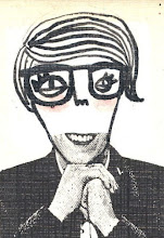
Having looked at Blair’s work, it is easy to see what a direct influence she has had on Taylor’s work. Taylor uses the same bright but slightly dulled colour palette in his work, which I think really provokes a vintage aesthetic. He also draws the human figure very similar to Blair, with an oversized head, teamed with very tiny feet. Like Blair, Taylor uses heavily textured backgrounds in his illustrations; although while hers are achieved by a paint brush and gouache, his are achieved by scanning in and manipulating images on a Mac. I think it’s really intriguing how even new technology can created such a vintage, hand produced-look.
What I love about Blair’s work, primarily, is her colour palette. Looking at her work has forced me to re-evaluate what colours I use in my work, which has never previously been a priority for me. What I like about the colours Blair uses are that they are bright, yet slightly dulled: they, along with the actual images, provoke a feeling of nostalgia for me – as though they were once bright, bold colours but have gradually faded over time. This time-weathered aesthetic is a look I would like to try incorporate into my work – I’ve already begun developing an unhealthy obsession for tea-staining paper at present.

Images from:
http://www.matterhorn1959.com/blog1/maryblair1.jpg
No comments:
Post a Comment