Liberty of London, opened in 1875 and founded by Arthur Lasenby Liberty, is an iconic shopping destination in London, selling carpets, furniture, and most importantly to me, fabrics. The brand, having been a household name for over one hundred years, displays new and old fabrics, with new reproductions of the original Liberty for London fabrics been made available. The Liberty for London fabrics have a very distinct look, I especially like the floral fabrics designed in the sixties; they are very reminiscent of a past period of time and, like Mary Blair’s work, provoke a sense of nostalgia. The fabrics look vintage but vintage in a modern way; it would be hard to distinguish whether some of them had been designed in 1969 or 2009.
This year, Liberty of London embarked on a collaboration with a major American retailer, Target, to create ‘Liberty of London for Target’. This entails floral teapots, floral piggy banks, floral soft furnishings and most impressively, floral bicycles!
The floral bicycles caught my eye, not only because I want to own one, but because I saw a direct link with my current work – making floral fabric aircrafts. Like me, Liberty of London for Target is circumventing the gender of something typically ‘male’; making a mundane and ‘boyish’ object into something beautiful and decorative.
Whilst researching for statistics regarding lost airline luggage, for my studio practice (as well as an odd personal interest), I came across this website. It’s the sort of thing a lot of people say but nobody actually goes to the effort of doing – and I love that she’s bothered to make a website!!
Personally, I collect vintage fabrics, old buttons, gig tickets and the usual crap, but a collection of suitcases??? That’s a collection that I am truly envious of. What you pack in a suitcase gives a snapshot about your life at a specific time and can give a viewer a lot of private information about you; where you are travelling and why, what kind of lifestyle you have and whether you have any disturbing secret habits.
This website has encouraged me to continue collecting... stuff! Because ‘stuff’ can prove to be a good source for generating and developing ideas for work, such as the ‘Thirty things I like/Dislike’ list I completed in September which is endlessly useful. Also, I like that she has made ‘work’ by very simply photographing her collection.
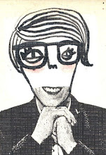
David Shrigley, born in 1968, is an artist based in Glasgow. He attended City of Leicester Polytechnic’s Art and Design course and studied Environmental Art at the Glasgow School of Art. He directed Blur’s video for ‘Good Song’, and in 2005, designed a London Underground leaflet cover. Shrigley is best known for his sardonically humorous drawings which are released in books and postcard packs, amongst other media.
I think the fact that I now love the work of David Shrigley, is a true testament to how much my understanding and appreciation of drawing has developed and evolved since September.I’ve been familiar with the work of Shrigley for quite a long time, but only in the past few months have I really started to consider him as one of my influences. Aesthetically, Shrigley’s work is much different to mine; he uses a deliberately limited technique in his black linear drawings juxtaposed with hand written text, often with crossing outs. He occasionally uses ruled lines with his text and image which jars oddly.
But what I really like about Shrigley’s work is his humour in his flat depictions about life, often written from the most obscure viewpoints. I like his style of composition with regards to how he puts together text and image and how each drawing looks as though he has isolated a single thought from his stream of consciousness and captured it on paper. His drawings look spontaneous, clearly not over-thought, which is an aspect of Shrigley’s work I would really like to replicate; his uncensored playfulness.
Mary Blair (1911-1978) was an American artist who is widely known for her work for the Walt Disney Company. She created concept art for Alice in Wonderland, Peter Pan, Song of the South and Cinderella, as well as a mosaic designed for display at a Disney World resort. Her illustrated children’s books from the 1950s are still in print, such as ‘I can Fly’ by Ruth Krauss. As requested by Walt Disney himself, Blair worked on the infamous ‘It’s a Small World’ attraction at Disney’s Magic Kingdom.
Although I have only recently begun to cite Blair as a major ‘Art Hero’ of mine, I have been familiar with her work since very early in my childhood. I grew up with Blair’s illustrations in children’s books and even on old packaging ( http://farm1.static.flickr.com/142/375166965_96599780a6.jpg ), but it was only from completing a two week drawing project that I was finally able to put a name to the artwork! Having been set two weeks to work in the style of Dan Taylor, illustrator of ‘Dogfish’, I decided to research Taylor’s influences; he cited his main visual influence to be Mary Blair’s work and this prompted me to research her.
Having looked at Blair’s work, it is easy to see what a direct influence she has had on Taylor’s work. Taylor uses the same bright but slightly dulled colour palette in his work, which I think really provokes a vintage aesthetic. He also draws the human figure very similar to Blair, with an oversized head, teamed with very tiny feet. Like Blair, Taylor uses heavily textured backgrounds in his illustrations; although while hers are achieved by a paint brush and gouache, his are achieved by scanning in and manipulating images on a Mac. I think it’s really intriguing how even new technology can created such a vintage, hand produced-look.
What I love about Blair’s work, primarily, is her colour palette. Looking at her work has forced me to re-evaluate what colours I use in my work, which has never previously been a priority for me. What I like about the colours Blair uses are that they are bright, yet slightly dulled: they, along with the actual images, provoke a feeling of nostalgia for me – as though they were once bright, bold colours but have gradually faded over time. This time-weathered aesthetic is a look I would like to try incorporate into my work – I’ve already begun developing an unhealthy obsession for tea-staining paper at present.
'Everything I Have' (2008) Simon Evans Pen, Paper, Scotch tape, White out
From the extremes of Chris Vine’s perfectly executed intricate paintings, to the crudely accomplished, yet oddly sophisticated work of Simon Evans, it may seem like a big leap. But beneath the quite obviously contrasting aesthetics, both artists create work that it driven by a clever wit and is a visual manifestation of a written idea.
I first came across the work of Simon Evans through a book that was bought for me as a present; ‘Vitamin D – New Perspectives in Drawing’. I’ve had the book just over a year now and find that when I re-look at it every few months, I can appreciate much more of the work each time. This time when I re-looked at the book, I noticed Simon Evans’ work in a light that I hadn’t looked at him in previously.
Evans is an appropriate artist for me to look at currently, in the sense that he uses elements of collage, which I have begun exploring myself, as well as juxtaposing text and image, and also, he has created some map-based works.
Following on from a recent Drawing Practice lesson, I found Evans’ ‘Directory of Purgatoire’ very interesting. Opposed to creating a map of an already existing physical place such as the UK, Evans’ has created a map, almost in the style of a room plan, of a psychological environment. Having thoroughly enjoyed the map exercise I was set in Drawing Practice, seeing Evans’ maps has prompted me to consider what physical or psychological environments I could document visually as a map, that relates to work I am making in ‘Application of Visual Investigation’.
'1000 Smiles' (2003)
Simon Evans
Mixed Media on Paper
‘1000 Smiles’ (2003) is a work of Evans’ in which he has painstakingly collages 1000 smiles, cut out from magazines and then pastes them in a numerically detailed grid. This looks reminiscent of Warhol’s silk screen on canvas, ‘Marilyn Monroe’s Lips’ (1962). Although many of the smiles look very similar, no two are exactly the same. In terms of technique, Evans’ ‘1000 Smiles’ also reminds me of Graham Rawle’s ‘Woman’s World’ collaged novel; the notion of committing oneself to such a meticulous task. I think I can appreciate these works because working on a small and detailed scale myself, means that a lot of the work I do is very meticulous and I love that he has actually gone to the trouble of collecting 1000 smiles, numbering and arranging them, all by hand, when other people might think ‘Why bother?’ I love the irony that even through using a quite a rudimentary method; cutting and sticking images from magazines, he has managed to create a piece of work that looks very sophisticated and quite formal – like a parody of a scientific chart.
'Women I'd Fuck in Time' (2004)
Simon Evans
Mixed Media on Paper
In the previous module, ‘Visual Investigation’, I used Evans’ ‘Everything I Have’ (2008) as a reference; this is a piece of paper on which Evans’ has visually documented every single object that he owns. Like Evans, I love to make lists; lists that may seem mundane and unnecessary to other people. Seeing how Evans visually translated his list via a combination of images and seemingly unrelated text, made me realise that my lists, themselves are ‘Work’ and that I could follow Evans’ simple ‘text and image’ approach and make them visual pieces of work opposed to just written lists. My favourite piece of Simon Evans’ work is ‘Women I’d Fuck in Time’ (2004), which contains some personal as well as historical references; ranging from the comical (Anne Frank), to the odd (Smurfette) to the downright bizarre (Medieval Ski Jackets ???). He cleverly mocks society’s impulsive need to hierarchically list very private, hidden information as well as very impossibly philosophical criteria.
Finally, I love how Evans’ uses completely illogical numbers for his lists, for example, ‘100 Reasons Why I Hate the Irish’ (2002) which only contains 33 reasons. It is very simple and subtle and something I recently adopted into one of my list-based pieces of work. Dominic Molon, author of the article about Simon Evans in the ‘Vitamin D’ book, notes, ‘The comically self-defeating mathematics of these list-based works emphasizes the ultimate futility and absurdity of our many attempts to limit or define the boundaries of the staggering complexity of human endeavour.’(Molon, D. (2005) p.98)... Very witty indeed!
Chris Vine attended college as a guest speaker last month, and is an artist who I am fairly new to; he studied at Bradford Regional College of Art and became a freelance artist/ illustrator in 1983 after lecturing in Art in Cumbria and London. I first came across the work of Chris Vine at Dean Clough Galleries, Halifax, on a visit in December. What initially struck me about his work was the very small scale of his paintings, many of which are only a few inches square. With small scale being such an integral part of my practice so far, I really admired Chris Vine’s small, detailed paintings and found myself spending a long time absorbed in the immense intricacy of their content.
After completing a drawing project in which I used gouache paints for the first time, I have a new found appreciation for his work as I can now understand the technical skill, not to mention the patience, required to mix gouache paint to the right consistency and colour, although Chris stated in his talk that he now uses acrylic paints in place of gouache. It was really inspiring to listen to someone talk about something they were truly passionate about and to hear about the huge commitment required to turn this passion into a job; he spoke about being given only a few hours to complete a piece of work and to digitally send it off but being so driven to fulfil his deadline.
Another aspect of Chris Vine’s work that I’m really intrigued by, is his use of using found text and phrases to generate ideas for his art work as I have just begun exploring this myself with found text and quotes; he states, ‘Much of my work revolves around humour and visual language. I use visual figures-of-speech; mixed metaphors, contradictions, palindromes, paradoxes and clashing cliches, to describe the real and imagined’(www.chrisvine.org, 16th March 2010). This is reflected in his subtle humour and clever wit, which are obvious in many of his works. Listening to Chris Vine discuss how important language and ‘sayings’ are to the process of generating ideas for his work has influenced me to collate a file of found text and quotes to help inform my work.
Image: ‘Pond Life’, 120cm x150 cm. http://www.chrisvine.org/pond-life.html
I aim to use this blog as a reflective journal in which I will collate research together; of artists I have looked at in past and current projects, as well as reviews I have collected and notes I have written about guest speakers. Ideally, I will take time to reflect on a weekly basis on research and work I have completed that week and consider the success or areas for improvement within my studio practice. I also aim to keep a notebook of my thoughts during studio time as a memory aid for reflection.


